Tuesday, December 11, 2012

"It's not chance, Mr. 'Olmes

it's chess."
this is not the princess bride :C
Now that I've gotten the BBC Sherlock reference out of the way I can proceed to bore you with my project
While making more references. Maybe.
eheheheh.
SO. We did drawings using ~perspective~. Drawings of games to be exact :D
<insert the game is afoot quotation here>
Back when my hair wasn't shortttt
So. Uh. Apparently I'm not allowed to c/p the questions anymore, so I can't get through as quickly.
Whelp
Uh.
 
Here, have this while I figure out my dilemma


Forget this, I do what I want >:C
Describe your overall thoughts on the final piece.  
How successful do you feel this piece is and why? 
What worked about this project? What didn’t work? 
If you were to do this project over again, what changes would you consider making? 
What was the most difficult part about completing this piece and why?
What did you learn from this piece?
Yeah. What now, mr. Sands? WHAT. NOW.

I liked this project? It was fun, and watercolors paints infused with dihydrogen monoxide are cool. I'm nto doing vocab, so forget that, and vocab in here is purely unintentional. I wonder how long I can avoid using vocab. Oh. watercolor paint infused with dihydrogen monoxide. let me fix that. And... done! Okay. So we used colored pencils sticks with color in them to go over the paint infused with dihydrogen monoxide to bring out the colors more and blend stir magically together the hading. or something.

 So. I'm done. I had fun. and this was a project and I have yet to get enough sleep why must the world torture me so why is it not the weekend or better yet why is it not ~CHRISTMAS BREAK~ (oh no! she said Christmas D: )
Oh. Right. Final product:
look at meeeeee :D


Monday, November 19, 2012

Now for something I don't care about

Ugh.
This.
Why read this when you could be paying attention to my ~amazing stencil~?
Go look at his face before reading this.
What am I doing with my life. Absolutely nothing. Oops :D

And yeah. So. Here's this thing.
Which was put at and angle to become this thing
Which is apparently supposed to look 3D.

1. Describe the process you went through to change your object into the correct perspective to create the drawing. This is when you were in the lab.
We used photoshop in order to distort it. And then we printed it nad put a gird on it and then we made a bigger grid on a different sheet of paper and then transferred the picture (in this case the apple of death and ponies) onto the bigger grid through the magic of FRIENDSHIP.
2. How did distorting and stretching the object allow for you to create a drawing that would look different to the viewer?
Because it wouls paarently make it look 3D. Which didn't work for me by the way. So I wouldn't know *wallows in self pity*
3. What were the most important concepts in the project to make it successful? 
Distorting it *more*.
This is the best apple though (extra Moriarty time)
I owe you a fall, Sherlock. I O U


In which Rebekah proceeds to fangirl over the British

Every fairytale needs a good old-fashioned villain.

Now for the one person that actually reads this blog (Hi Mr. Sands!) I apologize for the next little bit of gratuitous fangirling:

IGOTTODOMORIARTY'SFACEINCLASSANDITTURNEDOUTWELL AHAHAHAHAHAHAAHA SDFGASJKFBHSK

I'm good. I'm fine. Just fine. Eheheh.
So.
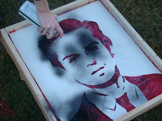
I did a stencil of this guy:
Look at his face

 His name's Andrew Scott and he plays one of the most brilliant villians. He plays Moriarty in the modern of Sherlock Holmes.

OKAY. Onto the "actual content". I don't know why you would /want/ the actual content when I could just spam you with pictures of his face and quotes from the show but whatever.

*spraypainting the stencil*
Question time:
Apparently I'm supposed to put in vocab words in my answers.
These words to be exact.
Stencil                 Spray Paint       Xacto Knife        Positive/Negative Space
Composition    Collage                Photoshop        Threshold              Contrast
1. Explain how you changed your photo in the lab to create a stencil.
 
We used PHOTOSHOP (but how can i make it MORE obnoxious?) and went to THRESHOLD to make it black and white and then we printed it out.
2. When creating the collage background explain your choices of colors, materials (magazine paper, books pages, etc), and placement. How does it relate to your topic? If no relation discuss general idea.
We tore out pages of books for our COLLAGE and glued them to the...thing.
3. Discuss the way positive and negative space was used to create your stencil.
 
4. When using the xacto knife, explain the safety procedures, how to use the knife and any challenges you had to overcome while cutting.
He had to cut away from outselves using the XACTO KNIFE and. Um. No challenges? It wasn't that difficult, actually.
5. How was your experience with the spray paint? Discuss how color choice is important, placement of stencil, and any other concepts you noticed while creating this.
The SPRAYPAINT was fun. Um. Since this guy was a villian I did black on red like so:
Honey, you should see me in a stencil.
Because those are obviously villian colors, yes/yes?

Moriarty. Yes. Him and his suits.

Monday, October 22, 2012

LINOLEUM, PAINT AND BAYERS, OH MY

What is sleep?
Apparently it's good for me or something.
Pfffffft. Idiots. Who needs sleep 8D
I'm on my tea high. Hush, children.

HOKAY. SO. WE DID PRINTS IN ART CLASS.
And it was fun because I got to cut stuff. Dunno why Mr. Sands thought it wise to give me pointy things, but  it happened. No small animals or children were harmed in the making of this print. Only a jaguarundi's dignity.

So. As always. Here's a self-evaluation. Thing. Also a pretty picture. Let's roll.

I cannot smile for a camera help. I can't tell if it was intentional or I was really trying to smile.


SELF EVALUATION (in which I begin sounding dull)


1.     Describe the overall composition of your artwork (balance, unity, rhythm and movement).
  In short? No. In long? NOOOOOOOOOOOOOOOOOOOOOOOOOOOOOOOOOO.

2.     How did you add texture and contrast to your print? Is this important? Why?
    So to make the prints, we had to carve into the linoleum block. The parts carved out would not show up if we put paint on them, allowing us to create texture/contrast by leaving parts un-carved. A way to add contrast was choosing colors. Like black paint in gold paper. It is indeed important, Mr Sands. It's not like you were talking about it in class or anything. Cough. ANYWAY. 'tis imporant because. Uh. It would be hard to tell what the image was without the texture (not to mention it would look so incredibly dull) or contast. However,  too much contrast (blue/oragneg, red/green) would make it look. Uh. Not. Good. And cause eyepains.

3.     Explain how you used positive and negative space to show your image.
   So I commented about how nice the day was, but then commented about how it would rain and be freezing cold within a few hours. Okay. Bad joke. I can't think, I'm trying to deal with the sugar overload in my tea ;_;. So. Positive and negative space. The whole thing relies on the positive and negative and how it is used. The positives and negatives are used to (oh my god terrible repetition help me) show the texture and assist in the contrast. Which I expained in prior question.

4.     Describe the craftsmanship of your print. (How good the project is technically crafted
  I guess it's pretty good? It's not bad and it's still pretty obviously a jaguarundi. Which looks like a mix between an otter and a cat, by the way. So. Adorable. Anyway. The positive and negative spaces are key in making the texture, which came out pretty well. You can tell what's leaves and what's wood and what's fur and stuff. And my contrast wan't atocious. So yis.

5.     Were you able to achieve depth by showing a foreground, middle ground and back- ground? Explain.
   Sure. I'll answer. Maybe.
Later.
*procrastinates*

6.     Explain your experience with Printmaking. What were the obstacles and advantages?
    Uh. it was fun? I got to cut things. Obtacles included not accidentally cutting myself. Advanteges included awesome jaguarundi print. Although now it looks like it has eyebrows...

Case in point.


Coming up next: Andrew Scott's beautiful villainous face on a stencil.

Thursday, October 4, 2012

PRINT SKETCH PROJECT CRAP

Okay, I've gotten lazy so. I'll just quickly answer this crap
 
1. Why is texture so important to have in your sketches?
So that it looks more impressive when you actually do the print thing.

2. Why is it neccessary for you to have several references of each animal and each background? Explain.
Having several references for a background and an animal gives a better picture in my mind for the composition of the background/animal.

3. When you look at your sketches are you able to see which sketch is the strongest and will make the best print? How do you know this? 
By doing that , I get to see what is the best texture and how the background works with the animal.

Gawd, 'm tired.

CHALK MURALS

Alternate title: Rebekah Cannot Wear Slacks in Art Class
Not that I can wear my slacks anymore, took a swan dive to save my phone and ripped said slacks. And my phone didn't even survive. RIP Charlie Dialsworth :C
HEY GUESS WHAT. MORE SELF EVALUATION. THANKS MR. SANDS. THANKS.

So what we had to do is make a mural out of chalk (not entirely accurate. A lot of it was pastels, too) which people could look like they were interacting with. So my group decided to do roasing marshmallows over a camp fire. Someone else is his other class did the TARDIS. I should have done the TARDIS. Screams.

SO. LAME. but I like the trees. (Fictional character day at school too)
1. Explain your experience working on a team and executing your ideas for the mural.
NO. Uh. It was pretty fun? I guess. Only CJ (on your right on the picture) really contributed; the other group members... not really much help. So. We had a hard time coming up with ideas. Eventually, after a bit of arguing, and reaching into our minds for whatever, we finally all agreed on the camp fire. So. We all came up with sketches, then colored sketches. Our picture changed a LOT since our sketch. Originally, there was going to be grass and no snow, so it iiked like summer or sometthing, with non-coniferous trees. Obviously the idea didn't keep (what with the lack of colors required at our disposal) so we had to change it.
2. Explain the importance of collaboration when working on a team.
Collaboration makes it a lot easier. With pretty much just CJ and I working, that was a good chunk of the work split between two people. But. We still finished early-ish so that was nice. But it was still a bit more stressful with 3/5 of our group not really participating.

3.  How successful was this project? Explain how and why.
Uh. It was successful. We got the mural done, and it's pretty interactable. We still finished with time to spare, and it doesn't look too crappy, with counts as a success to me. And we didn't die of frostbite, either. So. There's that :D

4. Explain how you feel about creating artwork that others can interact with. Ex. Invoving the whole school?
Uh. Same as anything else really. I doubt anyone's honestly going to interact with ours. Considering everyone else's is aweosmer, and unless you put INTERACTIVE CHALK MURAL over it on capital letters on fire with someone announcing it on a megaphone nearby, no one will really notice it's interactable.

Look at my bootiful face u gaiz

Friday, September 21, 2012

Value Portraits

Okay. So. For this value portrait thing, I need to do self-evaluation questions, at least three sentences. Thanks Mr. Sands. Just how I wanted to spend my morning. I'll try to make it interesting in the, what, 40 minutes I have left? While doing German homework. WHELP.

I need tea.

Her hidden eye is scaring me.
1. Explain the process you went through to develop your drawing.
...Sigh.Okay. So our teacher took black and white pictures of us, with the projector light shining on the side of our face so that we had plenty of shadows to work with. Then he printed out the pictures and we each got one of a student that wasn't, well, ourself. On tracing paper, we then made an outline of all the shapes, before coloring in the back, and redrawing over our lines over our sketchbook in order to put the lines themselves onto the sketchbook paper. And then we shaded and bended and yeah.

2. Explain how your found the different values of the portrait.
Uh. Okay. Basically I looked for areas with higher and lower contrast. I didn't blend the area with higher contrast while blending the areas with lower contrast. And this is a third sentence.

3. Did you achieve a full range of values in your portrait? How?
Through the magic of friendship. It is a very potent magic with the ability to-- *cough* You don't need to know that. Uh. Yes I did. Did dark where dark was, light where light was. Blending to get in-between shades.

4. Describe your craftmanship. Is the artwork executed and crafted neatly?
Oh for the love of. Yeah. I did all right. Uhhhhh I couldn't blend all the pencil strokes that well, and her hidden eye looks a lot more creepy than it should. I do like how her hair came out though. And it's relatively neat.

5. List any obstacles you've had to overcome and how you dealt with them.
HECK NAW. I'M F L A W L E S S. But serioiusly. Uhhh. I had problems at first with putting all the shapes together and shading it in a way so it made a face. And evening out her eyes. Cue erasing and reshading and yesh.

So yeah.

Wednesday, September 12, 2012

Desk Art: US History has no idea what it's in for.

So. My APUSH teacher informed the class that a) he approves of doodling in class and b) he likes desk art.

I'm going to have a field day.
All of time and space to choose from, and you choose to appear on a /desk/?

WHY ARE YOU WASTING ALL THAT BEAUTIFUL TEA
The phone camera skewed the pictures :C Oh well.
MUHAHAHA.

Thursday, September 6, 2012

Cartoon Skeletons

OH MY GOD I LOVED THIS PROJECT! *childish squeeing*
Okay. Just scalded my tongue on tea. I'm calm.

So. What we had to do was make a skeleton of a cartoon character. So I chose Queen Chrysalis from My Little Pony: Friendship is Magic. In my defense, I watch a lot of pain-inducing, sob-filled TV shows. BBC Sherlock (Reichenbach Fall. Dear LORD, Reichenbach fall. *gross sobbing*). Doctor Who (OH MY GOD DONNA NO). And the fans are even worse about inducing pain. So it's nice to have a light, fluffy show to cheer me up every so often. Anyway. Queen Chrysalis's villain song is awesome.

"Every pony I'll soon control, every stallion mare and foal. Who says a girl can't really have it all?"
*screech*
This was very entertaining. Oh my god. I love how unproportional they all are and dkfhsdjkfhsdjkhfk. I am so proud of her ribcage. Her hooves bother me, but seriously? Look at her legs. They have holes. I am not so sure that this was a successful piece, but I'm proud of it. The hardest part was, I guess, keeping the skeleton within the lineart? To account for the skin and muscle, etc. I'm fairly certain I put her skull ON the lineart. Oh well. I guess I'd try to rectify that if I did my piece over again. Still. I feel like I worked hard on her. Skeletons are fun. Cartoon ones, anyway.

I need sleep.

I will never not be sleepy.

Sketchity sketch.

So, in class, we had to draw a bunch of random items. Including turtles. You would expect they'd be relatively easy to draw, yeah?

HAH.

NO.

THEY KEPT MOVING.

Could be worse? Maybe. I dunno.

I'm the one standing up. Not enough chairs. At least this turtle actually stayed still :D

The turtle on the top left was a pain. Kept. Moving. Graah.
Okay. So. Apparently for each journal post, I need to "write about my experience" doing this project. Uh. All right. I liked the final product well enough, my favorite out of the things I needed to draw was the large turtle. Why? It was fun and interesting and she (or he. Call him/her "Cupcake".) actually stayed still. Cupcake was nice. I felt I did most of these pretty well, with a couple of exceptions. Except the pinecone. The pinecone was evil and should burn in the firey abyss of... something. If I could do it over, I'd probably work harder on the pinecone. The evil pinecone. Pinecones are not cool. Yeah. Actually, the pinecones were more frustrating than the turtles. Oh dear god what if pinecones had legs?!

... I should sleep earlier.

Apparently sleep is healthy or something.

Whatever.